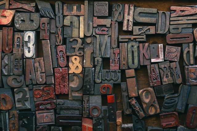
Mastering Visual Hierarchy
Visual hierarchy is a fundamental principle in graphic design. It refers to the arrangement of elements in a way that guides the viewer's attention. By mastering visual hierarchy, designers can create layouts that are not only attractive but also easy to navigate. This guide explores how to use visual hierarchy effectively in design.
What Is Visual Hierarchy?
Visual hierarchy is the organization of design elements based on their importance. It controls how viewers perceive information. When done well, it ensures that the most critical elements stand out. This creates a natural flow, leading the viewer through the design.
Without hierarchy, a design can appear chaotic. The viewer may not know where to look first. By establishing a clear structure, designers create a sense of order. This makes the design more understandable and enjoyable to interact with.
Size and Scale
One of the most straightforward ways to create hierarchy is through size. Larger elements tend to grab attention first. For example, in a poster, the headline is usually the largest text. This immediately draws the viewer's eye.
Designers use a scale to emphasize key information. Smaller elements are typically secondary or supportive. For example, body text is usually smaller than headings. By adjusting the size of elements, designers can control the order in which viewers process information.
Colour and Contrast
Colour plays a powerful role in the visual hierarchy. Designers use contrast to differentiate between elements. High contrast, such as black text on a white background, stands out more than low contrast combinations.
Bold colours often draw attention, while softer hues can take a backseat. For instance, using a bright colour for a call-to-action button makes it stand out. In contrast, more subtle colours are used for background elements.
By combining color and contrast, designers guide the viewer’s eye to the most important areas. This ensures that the critical information is seen first.
Typography
Typography is another key factor in visual hierarchy. Different font sizes and styles help establish the importance of text elements. Headlines are usually bold and larger, while subheadings are slightly smaller but still noticeable. Body text, on the other hand, is more uniform and neutral.
Designers can also use different font weights to create emphasis. Bold or italic fonts draw attention, while regular fonts recede into the background. The choice of font can also impact hierarchy. Decorative fonts are often used for headings, while simpler fonts are reserved for long passages of text.

Spacing and Alignment
Proper spacing and alignment are crucial for creating a clean hierarchy. Designers use spacing to separate elements and give them room to breathe. Crowded designs can confuse the viewer. On the other hand, well-spaced jeux de casino elements create a sense of organization.
Alignment ensures that elements are placed consistently. This helps establish relationships between different parts of the design. For example, aligning text with images creates a visual connection. Consistent alignment makes the design look professional and polished.
Proximity and Grouping
Elements that are close together are perceived as related. This is known as proximity. Designers use proximity to group similar elements. For instance, in a website layout, navigation links are usually grouped together at the top. This signals that they belong to the same category.
By placing related elements near each other, designers create logical groupings. This helps viewers navigate the design more easily. Grouping elements also reduces visual clutter, making the layout more efficient.
Use of Imagery
Images can play a significant role in the visual hierarchy. A large, bold image will capture attention faster than text. Designers often place important images at the top or centre of a design to draw the viewer in.
The placement and size of images can guide the viewer’s journey through the design. For instance, a large image at the top might lead the viewer to scroll down for more information. Designers can also use imagery to break up sections of text, making the layout more engaging.
Importance of Focal Points
Every design should have a focal point. This is the element that immediately grabs attention. It could be a headline, image, or call-to-action button. Focal points are essential for guiding the viewer's eye. Without a clear focal point, the design may lack direction.
Designers create focal points by making certain elements more prominent. This could be through size, colour, or placement. Once the focal point is established, designers build the rest of the layout around it. This creates a balanced and effective design.
Consistency and Balance
Consistency is key to maintaining visual hierarchy. Designers use consistent styles, colours, and fonts throughout the design. This ensures that the layout is easy to follow. A lack of consistency can confuse the viewer and disrupt the hierarchy.
Balance is also crucial. Designers must ensure that no area of the design feels too heavy or overwhelming. By distributing elements evenly, they create a harmonious layout. This makes the design more pleasant to look at.
Conclusion
Mastering visual hierarchy is essential for effective graphic design. By using size, color, typography, and spacing, designers can guide the viewer’s eye through the layout. Visual hierarchy creates order and ensures that the most important elements are seen first.
Whether designing a website, a poster, or a brochure, applying these principles helps create designs that are both functional and visually appealing. By understanding and using visual hierarchy, designers can enhance the viewer's experience and deliver clear, impactful messages.


